I visited the Apple Store in Monterey CA., three times in the last three months to buy products and noticed what a pleasant experience it was. These experiences combined with learnings from a recent MECLABs webinar, contributed to the criteria for our Website redesign.
Our Website is critical to generating inbound leads for business and our prior design was overdue for an update, it was text heavy and I was not happy with the look and feel and the CTA's were clunky and hard to read.
clean, light and well organized the place is.
There is no clutter, lot's of white-space and it feels good to be there. Take 15 paces into the store and you are greeted by an enthusiastic person who politely inquires as to your interests.
If appropriate the person will handle your inquiry themselves, or if a specialist is required, you will be introduced to the right person to handle your inquiry.
If it's really busy, you may have to find your own way to the product section of interest, but this isn't really a problem, because all of the products are arranged in separate areas and it's obvious where to go.
They are all gone, replaced by:
Which model do you choose when buying a new MAC or iPAD? The answer is, it depends on what you need and I have found the advice from Apple sales assistants to be helpful in making a decision and the check-out experience to be excellent.
Only once or twice have I had to wait in a checkout queue and this was a couple of years ago in the UK. Most of the time the sales assistant is able to get you what you need, make the transaction on the spot and email you a receipt, which is in your inbox before you get home. You are thanked for your custom and you leave the store with a smile on your face and the shiny new product in your hand.
I'm interested in your feedback on the Website, if you like it, or otherwise, please comment.
If you want to generate an increasing quantity of better quality inbound leads in a scientific way on your Website, then you might find the Inbound Marketing Whitepaper of interest.

Our Website is critical to generating inbound leads for business and our prior design was overdue for an update, it was text heavy and I was not happy with the look and feel and the CTA's were clunky and hard to read.
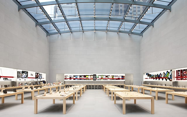
The Apple Store Experience
The first thing you notice when you walk into an Apple Store is howclean, light and well organized the place is.
There is no clutter, lot's of white-space and it feels good to be there. Take 15 paces into the store and you are greeted by an enthusiastic person who politely inquires as to your interests.
If appropriate the person will handle your inquiry themselves, or if a specialist is required, you will be introduced to the right person to handle your inquiry.
If it's really busy, you may have to find your own way to the product section of interest, but this isn't really a problem, because all of the products are arranged in separate areas and it's obvious where to go.
Getting Advice and Making a Transaction
Ten years ago I owned 2 Sony TV's, 2 Walkman CD's, a waterproof Walkman cassette player, a Sony PC and a Sony minidisc player. Buying all of the Sony stuff was a consumer experience, I dont think I bought any of it at a Sony Store.They are all gone, replaced by:
- 3 Macbooks
- 1 Macbook Air
- 1 iPAD
- 1 iTouch
- 3 iPODS
- 1 27" Apple monitor (great).
Which model do you choose when buying a new MAC or iPAD? The answer is, it depends on what you need and I have found the advice from Apple sales assistants to be helpful in making a decision and the check-out experience to be excellent.
Only once or twice have I had to wait in a checkout queue and this was a couple of years ago in the UK. Most of the time the sales assistant is able to get you what you need, make the transaction on the spot and email you a receipt, which is in your inbox before you get home. You are thanked for your custom and you leave the store with a smile on your face and the shiny new product in your hand.
New Website Design Criteria
The visit to the Apple Store was the opening brief with John McTigue of Kuno Creative who did our redesign. The critera for the design was heavily influenced by MECLABS advice and anyone who has attended their Webinars will see a few common themes:- It has to look and feel good when you land on the home page or the blog page.
- Instantly you should feel this is a place you want to spend time and maybe explore a little.
- Well laid out, lots of white-space, bright.
- Easy to navigate to available services, but not too many options to confuse the visitor.
- Clear calls to action with professional look and feel.
- Landing pages that are clear in their offer and easy to complete.
- A follow-up page to thank the visitor for making a download.
- Inside pages, blog and landing pages all share same bright look and feel.
I'm interested in your feedback on the Website, if you like it, or otherwise, please comment.
If you want to generate an increasing quantity of better quality inbound leads in a scientific way on your Website, then you might find the Inbound Marketing Whitepaper of interest.